

Ensuring Your Website Fits on Each and Every Screen
The “Multi-Screen” consumer is not a unicorn. The “Multi-Screen” consumer is nearly every consumer. Just think about this, how many types of screens are in your house or apartment? For quite a few people, the answer is at least four. Smartphone, tablet, laptop, desktop, even smart-television, we are living in the age of the screens. Unfortunately, most business owners don’t know how to appeal to what users really want in a mobile website.
Luckily for you, Absolute Web Services is here to help.
Responsive Web Design for Every Screen
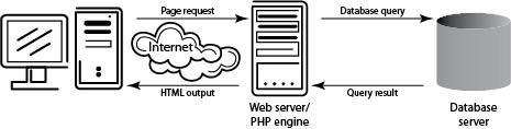
 There are quite a few ways to design mobile websites these days, but no solution has as much potential as responsive web design. Responsive web design is actually a programming and design technique that uses just one set of HTML coding. For responsive web design to work, a significant amount of complicated planning is needed.
Responsive web design isn’t easy, but it does help create one solution for every screen. The web design team at Absolute Web Services has the skills needed to create responsive websites that give your site a way to fit each and every screen. Some issues (like too much data for mobile users due to high-res images and giving to website assets to Google) must be overcome, but responsive web design has quickly become the choice to turn to for site design for every screen.
There are other options that we will talk about later, but here are the pros to responsive web design:
- A consistent user experience across all screens
- One convenient, easy to remember URL (no more .mobile)
- Reflexive orientation that fits any layout (landscape, portrait, wide-angled, etc.)
- No more redirects necessary for mobile design
Another Option: Dynamic Serving
If you want a dedicated website that perfectly matches individual, target devices, dynamic serving is the way to go. In this design method, custom pages can be programmed for any device (think iPad, Samsung Galaxy). This option might be the most resource dependent choice when it comes to fitting sites to every screen type, but it does provide a flawless site experience on every device.
Updating content, possible faulty device detection, and difficult to manage resources can make this solution a challenging one. Dynamic serving does, however, offer a completely customized user experience, simple changes for different devices, quick site loading, and a single URL.
A Website That Fits Every Screen
Building a website that fits every screen is absolute essential in today’s marketplace. According to data from Google, more than 1.5 billion mobile users exist today, and that number is only going to grow. Although some do still commit to creating a separate mobile site, Dynamic Serving and Responsive Web Design is now taking over the net.
At Absolute Web Services, we build dynamic, responsive websites that look great on every screen. With websites designed to fit every screen, business owners can appeal to a wider consumer base.

More Articles
EEE Miami 2024: A Monumental Success
The buzz of EEE Miami 2024 has finally settled, leaving…
Read more

Enterprise Ecommerce: Benefits of Migrating from Salesforce ...
In the fast-evolving landscape of e-commerce, selecting the right platform…
Read more
3 Ways to Personalize the Customer Experience
In today’s ecommerce landscape where competition is fierce, standing out…
Read more

Ecommerce Growth Strategy Over Hype: How Not ...
If you’re in ecommerce, there’s no getting away from the…
Read more

Top Ecommerce Conferences and Marketing Events to ...
In a rapidly evolving industry like ecommerce, staying ahead of…
Read more

Inc. 5000 & Absolute Web: Celebrating 6 ...
It’s with immense pride and gratitude that we announce Absolute…
Read more

The Most Inspiring Ecommerce Event. EEE 2023 ...
On February 23rd, the second edition of Ecommerce Experience Evolution…
Read more

What Shopify’s Checkout Extensibility Update Means for ...
Shopify Plus, an enterprise-level version of the popular Shopify ecommerce…
Read more
Social Feed